
5 Signs Your Confluence Content Needs Formatting Upgrades
Discover the warning signs that signal your team needs Confluence page formatting apps to create clearer, more consistent, and engaging documentation.
Published
Oct 5, 2026
Topic
Confluence
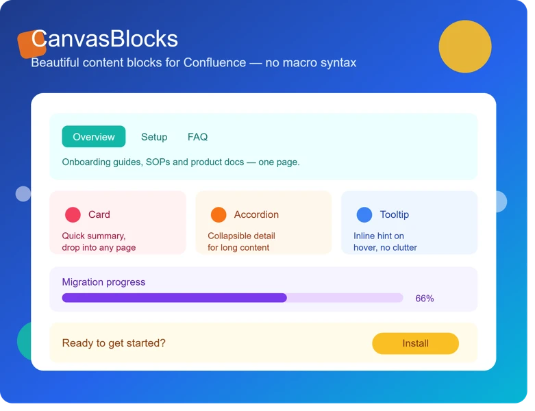
Make Every Confluence Page Easier to Use
Confluence can be the place where your team keeps project updates, processes, decisions, and shared knowledge. But even helpful information gets ignored when a page feels crowded, uneven, or hard to skim. We see formatting as more than decoration. It helps people find what they need and understand what to do next.
Clear layouts save time because readers can spot priorities without reading every line. Headings, short sections, callouts, and organized tables give project updates and requirements a natural path to follow. Instead of hunting through a wall of text, your team can quickly see the decision, owner, deadline, or risk.
October often brings a rush of documentation. As Q4 moves forward, teams may be recording annual results, planning future work, and preparing handoffs. When pages are poorly formatted, that extra documentation can create confusion instead of clarity. Better formatting supports onboarding, agile work, knowledge sharing, and cross-team visibility when the pace picks up.
Readers Keep Missing Important Information
Repeated questions are often a sign that key details are hiding in plain sight. A missed deadline, an overlooked policy update, or a forgotten action item does not always mean the information was never documented. It may simply be buried too deeply in the page.
Readers usually skim before they read closely. If a page has long paragraphs, weak headings, mixed font styles, and no visual breaks, important details blend into everything else. We recommend watching for signs such as:
- Important updates placed near the bottom of a long page
- Action items mixed into background information
- Large blocks of text with few headings
- Different colors, styles, and labels used without a clear pattern
- Questions that are already answered somewhere on the page
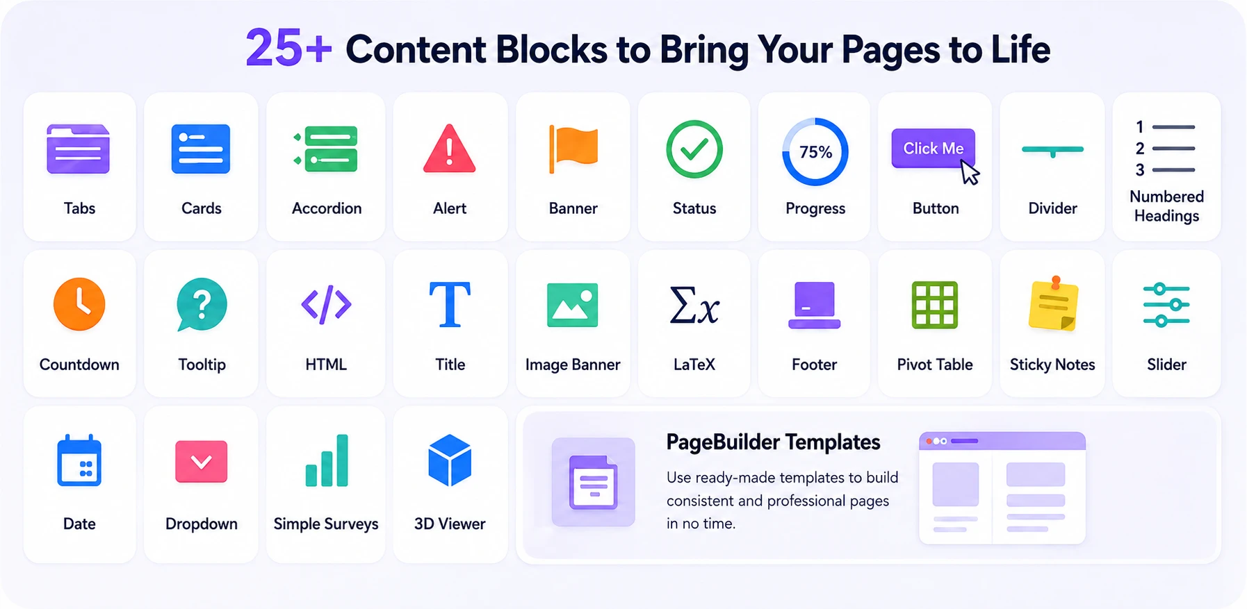
Confluence page formatting apps can help bring the right details forward. Panels can flag a warning or decision. Expandable sections can keep background notes available without making the page feel endless. Tabs and structured layouts can separate audiences, while visual callouts can make deadlines, risks, and next steps easier to notice.
This matters for many everyday pages. Release notes need users to see what changed. Incident postmortems need clear follow-up actions. Onboarding guides should make the first steps obvious. Sprint retrospectives need decisions and improvements to stand out. Service management procedures must be easy to follow when someone needs help quickly.
Create a Consistent Look Across Teams
A Confluence space can feel confusing when every team documents work in a different way. One page may use large headings and status labels, while another relies on colored text and a manually built table. People then have to relearn how to read every new page they open.
Common trouble spots include uneven heading levels, irregular spacing, mismatched status labels, and several different ways to show the same project detail. These choices may seem small on their own, but they make reporting and knowledge sharing harder over time.
Repeatable templates give teams a helpful starting point. We can use the same basic structure for project plans, meeting notes, technical documentation, product requirements, release updates, and support procedures, while still leaving room for team-specific details. A familiar page structure helps readers know where to find context, progress, decisions, and next actions.
As organizations grow, shared visual standards also support better governance. New employees can understand how to contribute sooner. Teams know what information belongs on a page. Leaders can review updates without sorting through several different formats. Consistency does not make documentation stiff; it makes it easier to trust and use.
Make Tables and Reports Easier to Scan
Basic tables and plain-text updates have limits. If readers need to scroll sideways, decode unclear labels, or compare rows by hand, the information may need a better presentation. Complex updates are easier to understand when the page shows structure at a glance.
We often see these topics benefit from clearer visual formatting:
- Sprint progress and team capacity
- Release readiness and dependency tracking
- Risk registers and decision logs
- Service metrics and support trends
- Quarterly goals and project milestones
Color-coded status fields, progress indicators, organized tables, charts, and visual roadmaps can make a reporting page easier for both technical and nontechnical readers. Instead of asking people to interpret every data point, the page can show what is on track, what needs attention, and where a decision is needed.
That clarity is especially helpful in October. Q4 reporting often includes end-of-year delivery plans, goal reviews, leadership updates, and blocker discussions. A clean project status page can help teams spot issues early enough to act, rather than discovering them in a rushed meeting near a deadline.
Reduce Manual Formatting Workarounds
Manual workarounds can quietly eat up a team's time. Copying information from spreadsheets, adjusting table widths again and again, adding screenshots for context, or rebuilding the same layout for each update can signal that your current page tools are falling short.
Those habits also create small errors. A copied table may not match the latest source. A screenshot can go out of date. A rushed page may use different labels than the previous update. The result is inconsistent documentation and less time spent improving the content itself.
With reusable layouts, structured templates, and clearer page components, teams can build readable pages without needing design skills. The goal is not to make every page flashy. It is to make the right information easier to create, maintain, and understand.
Better Confluence pages also support the wider Atlassian workflow. Jira issues and project activity can be presented in a clearer context. Jira Service Management knowledge articles can guide users through support steps. Shared reporting pages can give cross-functional teams one place to understand work without relying on disconnected spreadsheets and screenshots.
Turn Better Formatting Into Better Team Decisions
A useful place to start is with the pages your team depends on most. Review Q4 plans, project updates, onboarding materials, support procedures, and leadership reports. Pay attention to pages that receive frequent views, prompt repeated questions, or require people to open another spreadsheet before they can understand the update.
At RVS Softek, we develop apps for Confluence, Jira, Jira Service Management, and monday.com that support documentation, visualization, reporting, agile planning, and workflow efficiency. We encourage teams to define simple documentation standards for headings, status indicators, templates, tables, and visual elements so each space feels familiar and useful.
Small improvements can make a noticeable difference. When readers can find the next step, see the current status, and understand the context without extra searching, Confluence becomes a stronger source of truth for everyday decisions.
Make Every Confluence Page Easier To Use
At RVS Softek, we help teams choose Confluence page formatting apps that make documentation clearer, more consistent, and easier to maintain. Our approach focuses on practical tools that support the way your team already works. If you need help identifying the right fit, contact us to start a conversation with our team.
Frequently asked questions
How can I improve Confluence page formatting?
Use clear headings, shorter sections, tables, lists, panels, and consistent layouts to make Confluence pages easier to scan and navigate.
What are the best Confluence formatting tools?
The best Confluence formatting tools depend on your needs, but useful tools can provide richer layouts, reusable content blocks, advanced tables, and more flexible page structures.
How do I make a Confluence page easier to read?
Break long content into clear sections, highlight important information, use visual elements where useful, and maintain consistent formatting throughout the page.
How do I standardize Confluence pages across teams?
Use consistent page structures, templates, and reusable formatting elements for recurring documentation such as project updates, reports, and technical documentation.
When should I use a Confluence formatting app?
Consider a formatting app when your team repeatedly needs layouts, content structures, or formatting capabilities that are difficult to create or maintain using native Confluence features.
Written by the team building RVS Softek's apps for Jira and Confluence.
Ask us a questionMore from the blog
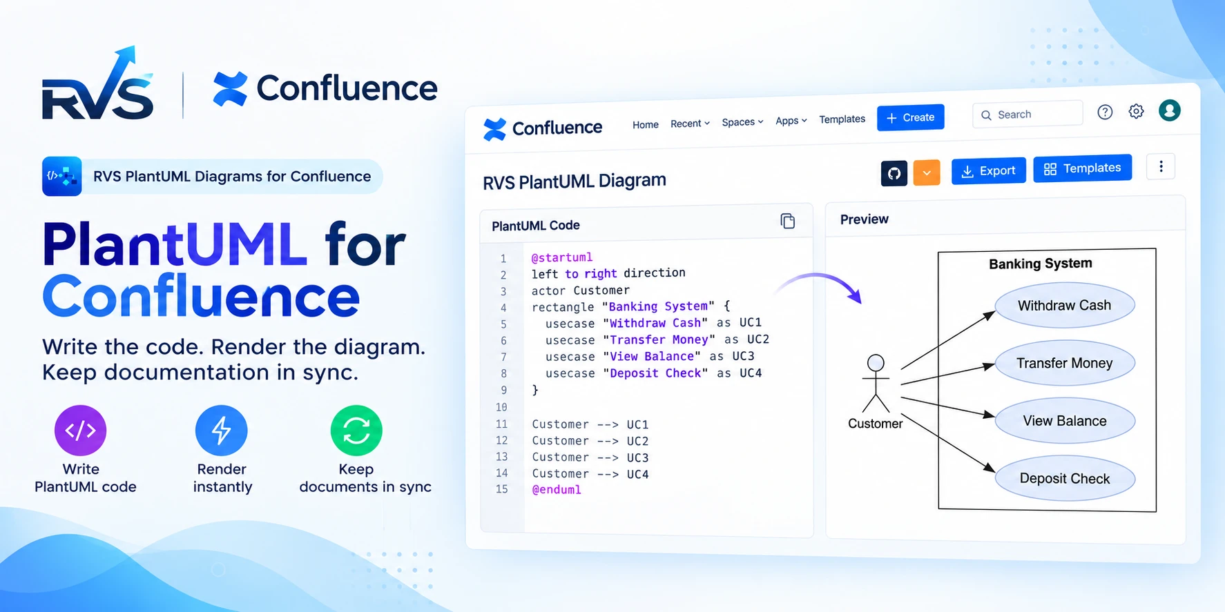
PlantUML for Confluence: RVS vs Stratus
Compare RVS and Stratus PlantUML apps for Confluence: Git integrations, templates, diagram types, Cloud vs Data Center support, and migration.
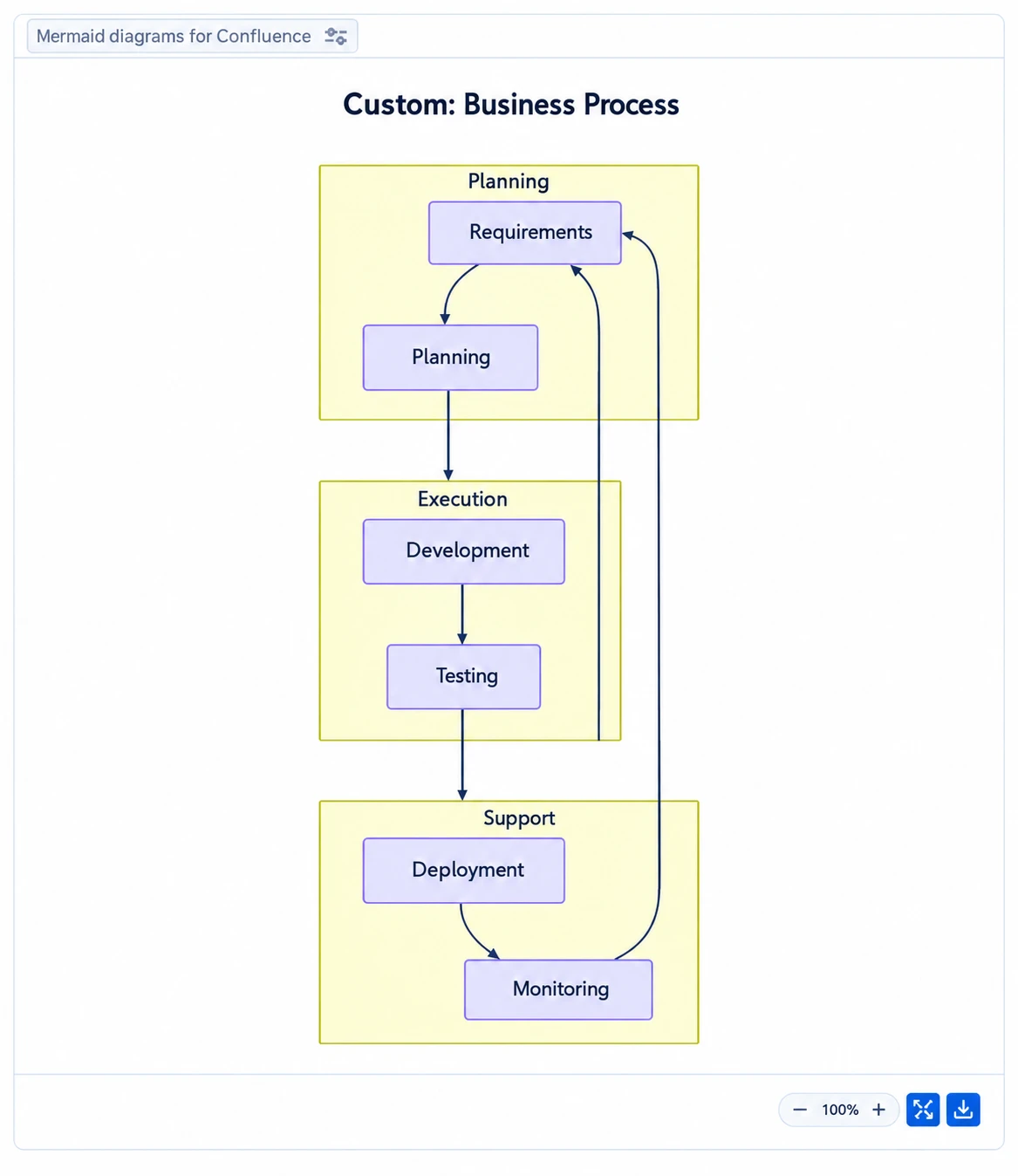
Speed Up Confluence Reviews With Mermaid Diagrams
Learn how Mermaid diagrams for Confluence turn complex ideas into clear visuals, streamline feedback and help teams complete documentation reviews faster.
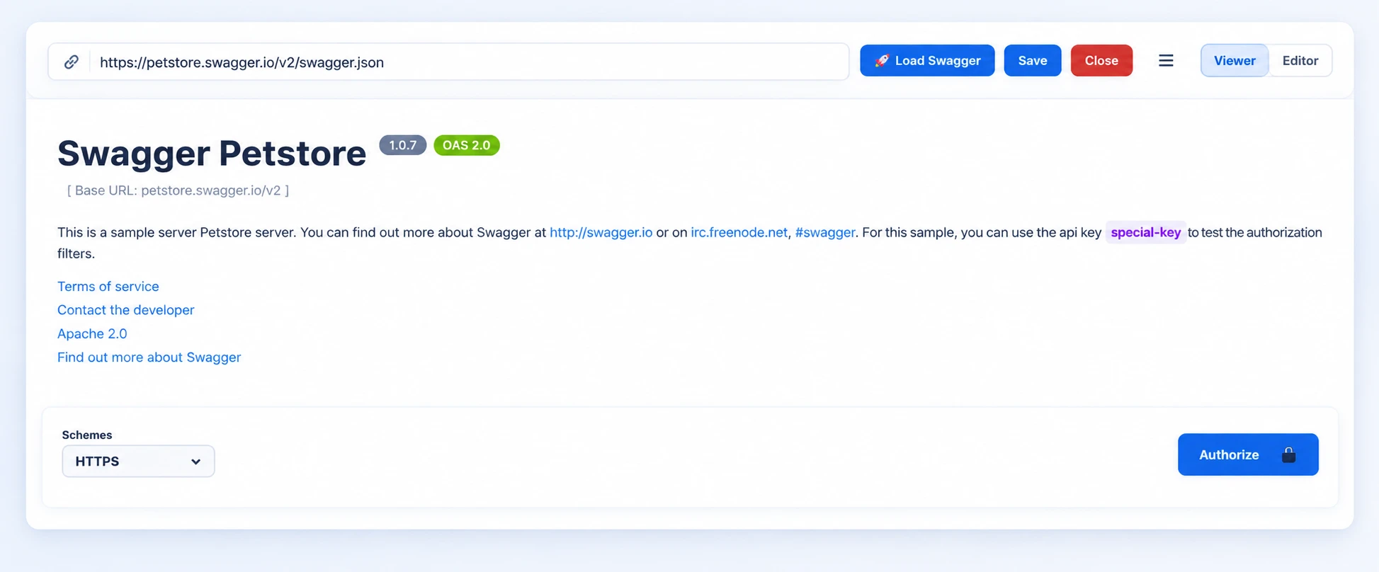
Can Live Swagger Documentation Reduce API Review Delays?
Speed up approvals and reduce rework with Swagger API documentation in Confluence that stays current, clear, and easy for reviewers to access.
Find the RVS Softek app your team needs
Browse the catalogue for Jira, Confluence and monday.com — or install straight from the Atlassian Marketplace and start a free trial in minutes.
- Free trial on every paid app
- Runs on Atlassian
- Support in one business day
16 apps · 1,873+ installs · Runs on Atlassian