
In recent years, dark mode has become a prominent feature across various apps, websites, and devices. Initially available only on a few select platforms, it has now gained widespread adoption, becoming a standard feature on mobile phones, computers, and operating systems.
In recent years, dark mode has become a prominent feature across various apps, websites, and devices. Initially available only on a few select platforms, it has now gained widespread adoption, becoming a standard feature on mobile phones, computers, and operating systems. The shift toward dark mode is not just a trend in design but also has practical implications for usability, accessibility, and even health.
Dark mode, also known as night mode, is a display setting where the background of an interface is dark (typically black or deep gray) and the text is light (usually white or light gray). This contrasts with the standard "light mode," where the background is light and the text is dark. Essentially, dark mode is the inversion of the typical light background, providing an alternative aesthetic and functional choice for users.
The rise of dark mode can be traced back to its roots in the early days of computing. Early computer monitors used CRT screens that emitted light, meaning black backgrounds and bright text were easier on the eyes. However, as displays evolved and transitioned to LCD and OLED screens, the light mode became the standard. Now, thanks to increased understanding of user preferences and technology improvements, dark mode has made a resurgence.
Dark mode has seen an incredible surge in popularity, largely driven by its integration into popular apps and operating systems. Early adopters were tech enthusiasts and developers who sought out apps or tweaks to enable dark mode, but as mainstream platforms like Facebook, Twitter, Instagram, and YouTube added dark themes, more users embraced the feature.
In 2019, Apple integrated system-wide dark mode across all its devices, including macOS, iOS, and iPadOS. This move catalyzed a wider trend, prompting Android, Microsoft, and various third-party applications to follow suit. Today, most operating systems and apps offer dark mode as an optional setting, giving users the ability to switch between light and dark themes based on their preferences.
While dark mode is touted as being beneficial for many, it is important to remember that not everyone may benefit from it equally. For individuals with certain visual impairments, such as low vision or astigmatism, dark mode can actually exacerbate issues like blurriness or contrast sensitivity. Some users may find dark mode difficult to read due to the increased contrast between text and background.
Developers are becoming more mindful of these issues, implementing features like customizable text size, contrast settings, and color schemes that can provide more accessibility options for users.
As technology continues to evolve, dark mode is likely to remain a significant feature of digital interfaces. We may see even more advanced implementations in the future, such as dynamic modes that adjust based on ambient lighting or the time of day. There's also the potential for enhanced customization, allowing users to fine-tune dark mode settings to better suit their preferences.
Moreover, the increasing focus on accessibility means that developers will likely continue to refine dark mode, ensuring it is usable by a wider variety of people. Tools like adaptive contrast, colorblind-friendly palettes, and automatic switching could become standard features, making dark mode both user-friendly and inclusive.
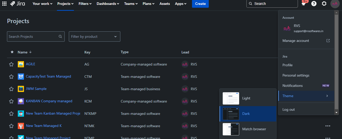
To switch to dark mode, you should click on the icon of your profile photo in the top right corner of your screen. Choose the “Theme” option, and select the option "Dark"
All our popular apps in the Atlassian Marketplace support dark mode
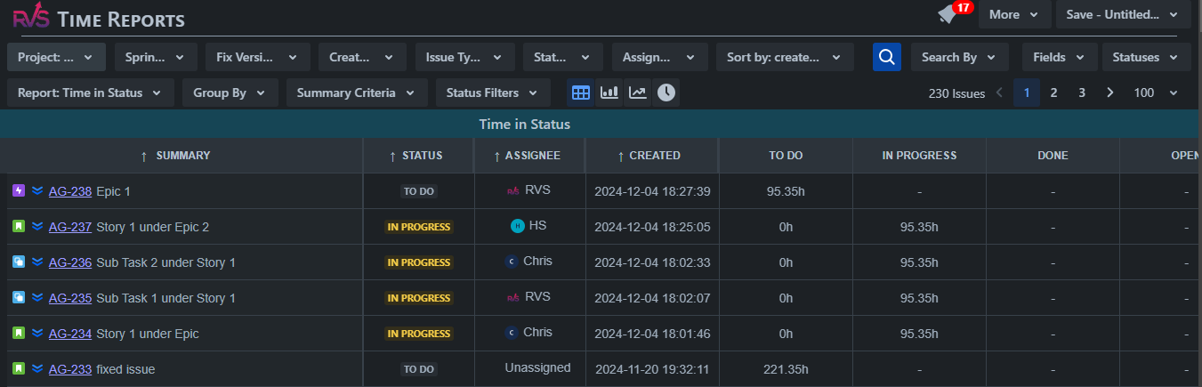
This app shows how long each issue has spent in your workflow statuses. It helps to make urgent decisions regarding team workflow steps. You can filter data by Project, Fix Version, Sprint, Issue created date, Issue Types, Status, Assignee, Jira Filter, JQL. It will help to generate an accurate, detailed report based on the chosen criteria.
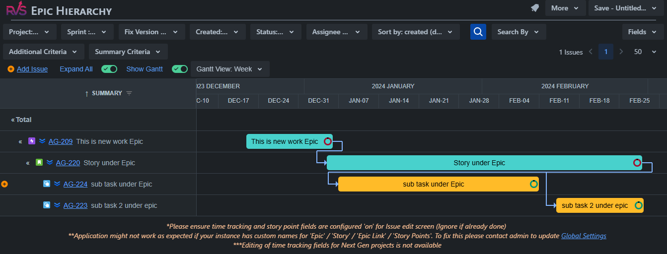
View the full Jira Issue Type hierarchy of Linked issues, Portfolio/Advanced Roadmaps, Epics, and Subtasks up to 10 levels. Gantt View, Sum up Time Spent, Org Estimate, Time Rmng, % Complete
Dark mode is much more than a design trend; it is a functional and aesthetic choice that many users now expect across devices and applications. With its potential to reduce eye strain, save battery life, and even improve sleep, it’s clear why dark mode has gained such widespread appeal. However, it’s important for users and designers alike to consider its drawbacks and ensure that it remains a customizable and accessible option for everyone. As technology advances, dark mode will continue to be refined, making it an even more integral part of our digital experience.
September 17, 2025
Jira's Time in Status report by RVS is a powerful tool that helps teams analyze workflow efficiency, identify bottlenecks, and optimize processes. Here are some real-world use cases
Read MoreSeptember 10, 2025
Managing project timelines and ensuring timely delivery is a crucial aspect of any project. Measuring the status transition duration in Jira helps you track how long an issue spends in each stage of its lifecycle. You can use different methods to measure this, depending on your Jira setup and available tools.
Read MoreAugust 13, 2025
Aren’t all the businesses that are working on various projects willing to invest their time! Investing time in the right direction is the key to good project management, and analysing and managing this correctly is an intrinsic quality of a good project manager.
Read More


