The Problem: Jira data is scattered across tickets, making it hard to see what’s actually happening.
The Shift: Move from raw issue lists to a centralized, real-time dashboard that shows key metrics clearly
The Fix: Use Jira dashboards with the right gadgets to track progress, spot bottlenecks, and stay aligned daily.
The Upgrade: Go beyond native dashboards with tools like Dashboard Charts for deeper insights and better visualization.
Keep reading to learn how to build, customize, and use Jira dashboards to improve team visibility and delivery speed.
Every Jira ticket holds a piece of data, but a list of tickets isn't a strategy. Reports are what turn that raw data into actionable answers. Whether it’s a burnup or a velocity chart, the goal is the same: to stop looking at what happened and start seeing why it happened.
This is why a well-configured Jira dashboard is so critical. Instead of digging through filters, a dashboard brings your most important metrics into a single, real-time view. It acts as your project’s central hub, translating messy backlogs into clear visual charts that tell you exactly where your team stands.
While Jira's native tools get you started, you can go much further. By using a specialized plugin like Dashboard Charts for Jira, you can transform basic reporting into a high-level analytics engine, unlocking a whole new level of Jira dashboard customization.
This blog explores how to master Jira dashboards and how to use them as a roadmap for identifying bottlenecks and accelerating your team’s delivery.
What is Jira Dashboard
A Jira dashboard is your personalized command center within the Jira platform, a configurable home screen that gives you a real-time, at-a-glance view of everything that matters to your projects and team. Rather than digging through multiple boards, queues, and reports, the dashboard brings the most critical information together in one place.
Beyond just viewing data, Jira dashboards customization allows you to choose your layout, handpick your gadgets, set access permissions, and even create multiple dashboards for different teams or projects. This level of flexibility is what makes a Jira dashboard genuinely useful rather than just another reporting screen.
Key Features of Jira Dashboards
Customization: Fully customizable dashboards to fit your team's needs, with predefined or custom gadgets to track specific KPIs.
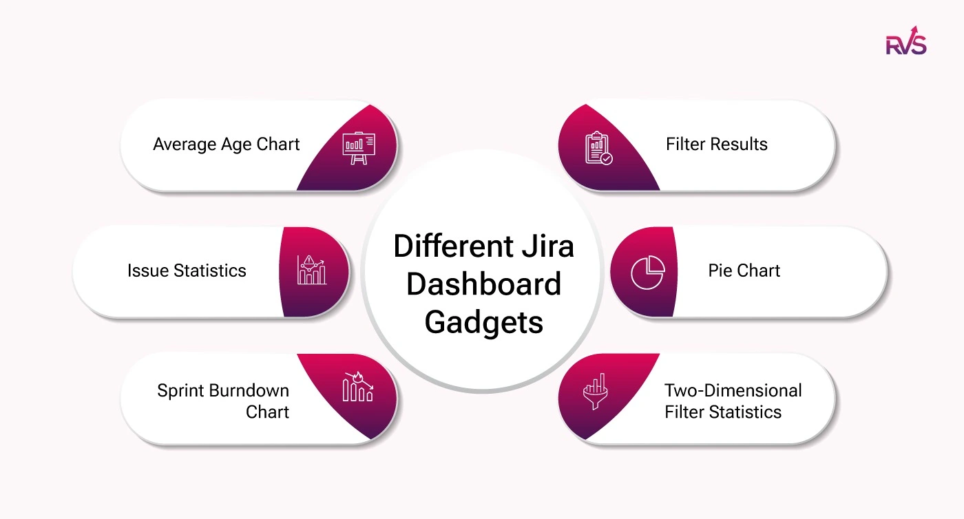
Widgets/Gadgets: Modular elements like Pie Charts, Issue Statistics, Sprint Burndown Charts, and Filter Results to visualize key metrics.
Real-Time Insights: Dashboards update in real-time, reflecting the latest data for informed decision-making.
Access Control: Share dashboards with specific users and set permissions to control who can view or edit them.
Multiple Dashboards: Create separate dashboards for different roles or projects, ensuring clear focus for each team.
Jira Dashboard Gadgets & How to Use Them
Gadgets are the building blocks of any Jira dashboard. Each gadget is an independent, configurable widget that pulls live data from your Jira projects and displays it in a focused, digestible format.
Jira's native gadgets are genuinely useful and easy to get up and running with. But as your projects grow and your reporting needs become more specific, you may find yourself wanting more flexibility in how you visualize and present your data.
This is where Dashboard Charts for Jira comes in. It is a dashboard reporting add-on that builds on the solid foundation of Jira's native gadgets, giving you the ability to create richer, more customizable charts and graphs directly on your dashboard, all while keeping the same straightforward experience you are already used to.
Popular Jira Dashboard Gadgets
Here are some of the most popular types of gadgets:
Filter Results
Displays issues based on custom Jira Query Language (JQL) filters, ideal for tracking specific sets like unresolved bugs or tasks assigned to a team member.
Pie Chart
Visualizes data distribution (e.g., priority, assignees, statuses) to assess where most of your team’s work is focused.
Two-Dimensional Filter Statistics
Analyzes relationships between two data sets (e.g., issues by assignee and status), helping identify patterns for better decision-making.
Sprint Burndown Chart
Tracks sprint progress by comparing completed work against planned scope, helping identify delays or bottlenecks.
Issue Statistics
Provides key metrics on issues, such as open vs. resolved, broken down by category, for a quick project health snapshot.
Average Age Chart
Tracks the average time issues have been open, helping identify bottlenecks and areas for process improvement.
These gadgets can help project managers and team members quickly visualize key performance trends and assess progress.
How to Add Gadgets to Jira Project Dashboards
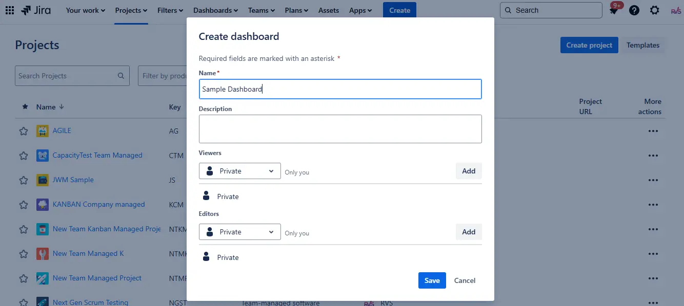
Creating a Jira project dashboard is straightforward. Follow these steps:
1. Navigate to Dashboards
Go to the Dashboards menu in Jira.
Select Create Dashboard.
2. Provide Dashboard Details
Name your dashboard.
Optionally, provide a description.
Select whether you want the dashboard to be private, shared, or available to a specific group.
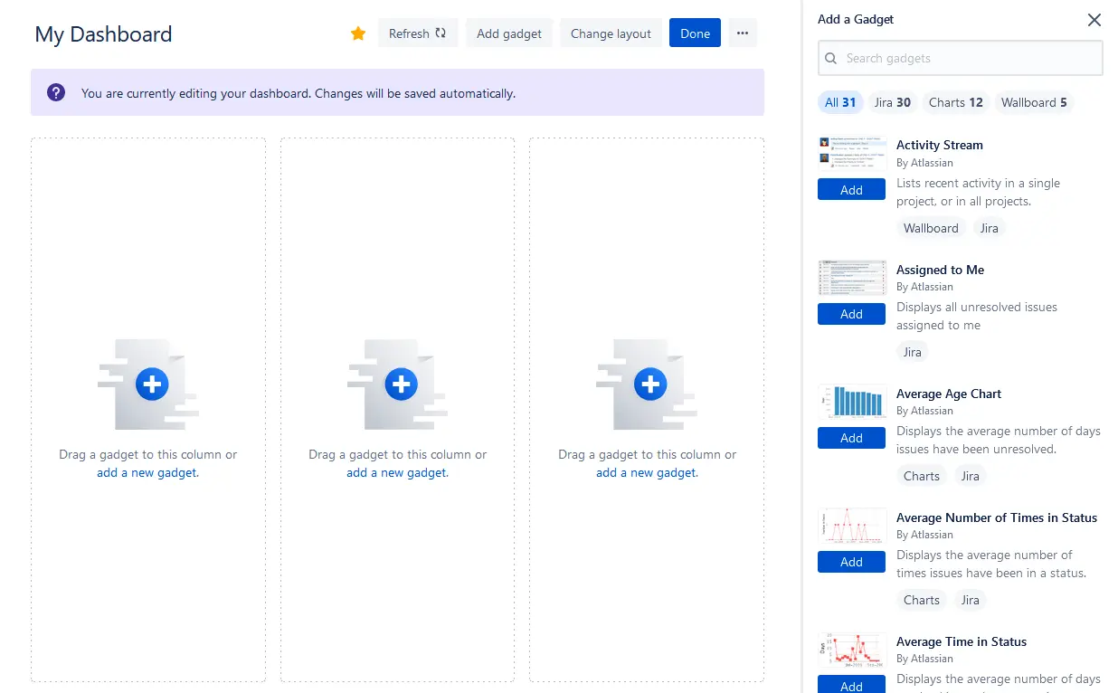
3. Add Gadgets
Once the dashboard is created, click Add Gadget.
Choose the gadgets that are relevant to the insights you want to monitor.
Configure each gadget with the appropriate filters, projects, or JQL queries.
4. Arrange Your Dashboard Layout
Drag and drop gadgets to rearrange them on your dashboard.
Resize the gadgets to focus on the most critical data.
5. Save and Share
Once the dashboard is set up, save the changes.
Share it with team members, stakeholders, or groups as necessary.
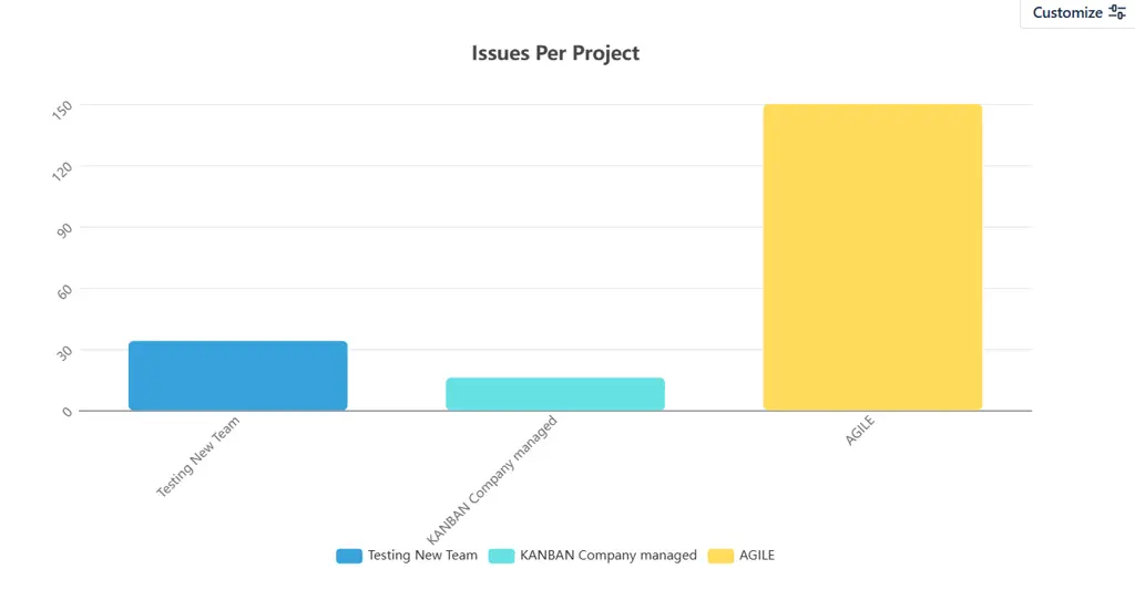
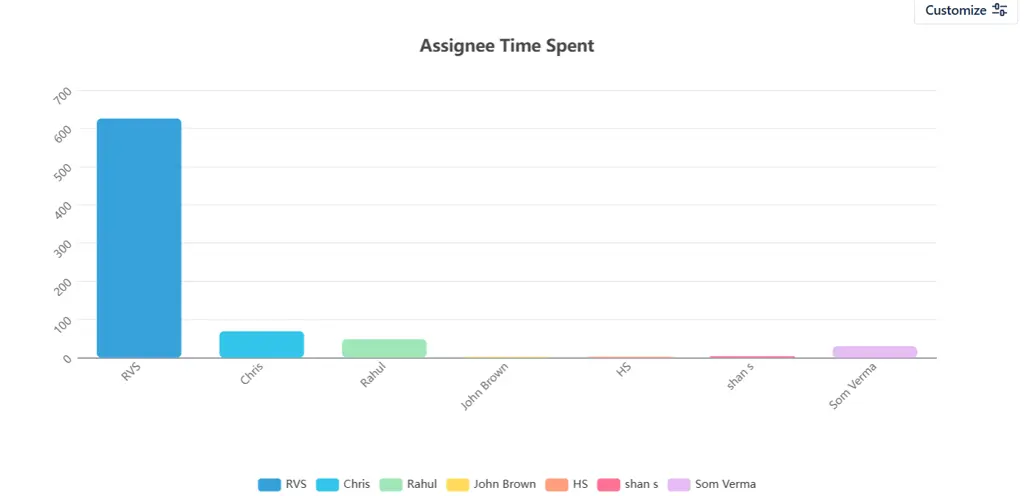
After saving the configuration, you will see the gadget as shown below:
Do's and Don'ts of Jira Dashboard Customization
Here is a quick dos-and-don’ts list for customizing your Jira dashboard to improve project visibility.
Do's ✅
Don'ts ❌
Layout
Arrange gadgets by priority, placing the most critical information at the top
Randomly place gadgets without a logical flow, forcing users to hunt for key data
Gadgets
Choose gadgets that are directly relevant to your role and daily workflow
Add every available gadget just because it looks useful — less is more
Data Filters
Configure each gadget with specific project filters to show only what matters
Leave gadgets on default settings that pull in irrelevant or overly broad data
Sharing
Share team dashboards with the right permission levels for collaboration
Share dashboards publicly or with wider audiences than necessary
Naming
Give your dashboard a clear, descriptive name, so it is easy to identify
Use vague names like "My Dashboard 1" that become confusing over time
Maintenance
Review and update your dashboard regularly as projects and priorities evolve
Set up a dashboard once and never revisit it as your team's needs change
Charts & Visuals
Use visual gadgets like charts and graphs to make data easier to digest quickly
Rely solely on list-based gadgets that require reading through rows of data
Team Dashboards
Align shared dashboards around a common goal that everyone on the team cares about
Build a shared dashboard based purely on personal preferences that don't serve the team
Performance
Keep the number of gadgets lean to ensure your dashboard loads quickly
Overload a single dashboard with 15+ gadgets, slowing down load time and usability
Customization
Use tools like Dashboard Charts for Jira to go beyond native gadget limitations
Settle for default visuals when your reporting needs have clearly outgrown them
Now that your dashboard is set up with the right gadgets, you might find yourself wondering, when should I use my dashboard versus running a Jira report? It is a common question, and understanding the difference helps you get far more value out of both.
Jira Dashboard vs Jira Reports: What's the Difference?
Both dashboards and reports pull from the same Jira data, but they serve very different purposes. Here is a clear breakdown of each:
Jira Dashboard: Real-Time Monitoring
Lives on your home screen and is always up to date
Gives a live, consolidated view of sprints, issues, workload, and KPIs
No need to "run" anything, data refreshes automatically
Best used for daily stand-ups, team check-ins, and ongoing project visibility
Highly customizable with gadgets tailored to your role and workflow
Jira Reports: Deep-Dive Analysis
Generated on demand for a specific metric or time period
Covers burndown charts, velocity reports, cumulative flow diagrams, and more
Best used for sprint reviews, retrospectives, and stakeholder presentations
Ideal for answering specific questions about past performance
Focused on what happened and why, rather than what is happening now
Quick Comparison
Jira Dashboard
Jira Reports
Purpose
Real-time project monitoring
Retrospective analysis
When to use
Daily check-ins and stand-ups
Sprint reviews and presentations
Data view
Live, continuously updated
Generated at a point in time
Customization
Highly flexible with gadgets
Limited to preset report templates
Best for
Teams, managers, stakeholders
Project managers, scrum masters
So, Which Should You Use?
Use both, but for different purposes:
Dashboard for day-to-day visibility and keeping your team aligned
Reports for structured, in-depth analysis and formal reviews
Where teams often hit a wall is when they need their dashboard to deliver reporting-level depth without switching tools. This is exactly where Dashboard Charts for Jira bridges the gap, bringing advanced reporting capabilities directly into your dashboard, so you have both a Jira dashboard and a jira reporting tool in one place.
Conclusion
A well-built Jira dashboard is one of the most impactful things you can do for your team's productivity and project visibility. From understanding what gadgets to use, to knowing when to lean on reports versus your dashboard, every decision you make in your setup brings your team one step closer to working with clarity and confidence.
But the real unlock comes when you stop settling for what Jira gives you out of the box. With Dashboard Charts for Jira, you get a smarter, more flexible dashboard experience, richer charts, deeper insights, and seamless collaboration, all without adding complexity to your workflow. And with add-ons like Time in Status and Worklog Time Tracking, your dashboard becomes a true command center for everything happening across your projects.
Whether you are setting up your first dashboard or looking to level up an existing one, the tools are right there waiting for you.
Frequently asked questions
What are Jira software reports, and how do they work?
Jira software reports are pre-built or customizable reports that provide detailed insights into your project’s performance, team progress, and issue status. These reports include data on issues, workflows, sprint progress, and more. They help track project health, identify bottlenecks, and ensure alignment with goals.
How can I use Jira dashboard examples to improve my project tracking?
Jira dashboard examples can help guide you in creating effective dashboards tailored to your team’s needs. By studying these examples, you can visualize key metrics, such as team performance, issue tracking, and sprint progress, and then customize your dashboard to fit your project requirements.
What types of reports can I generate with Jira software?
Jira software offers various reports such as Sprint Burndown, Issue Statistics, Velocity Chart, Cumulative Flow Diagram, and Time in Status. These reports give you detailed insights into project progress, task completion, and team efficiency, making it easier to make data-driven decisions.
Can I customize my Jira dashboards to include specific Jira software reports?
Yes, you can customize your Jira dashboards to include specific Jira software reports by adding gadgets that pull data from the reports you want to track. For example, you can include a gadget for Issue Statistics or Sprint Burndown to visualize relevant project data in real-time.
What are some common Jira dashboard examples for agile teams?
Common Jira dashboard examples for agile teams include:Sprint Progress Dashboard: Displays the sprint burndown chart, issue statistics, and sprint velocity.
Team Performance Dashboard: Shows issues assigned to each team member, time in status, and resolution rates.
Backlog Health Dashboard: Tracks backlog issues, newly created issues, and their priority.
How do Jira software reports help in identifying project bottlenecks?
Jira software reports like the Time in Status and Cumulative Flow Diagram help identify bottlenecks by showing how long tasks have been stuck in specific workflow statuses. These reports highlight areas where tasks are delayed, allowing you to address issues promptly.
Can I share my Jira dashboard examples with others?
Yes, you can share your Jira dashboard examples with team members, stakeholders, or specific groups. This allows everyone to stay aligned and have access to the same key project metrics. You can control who has view or edit access to ensure proper data security.
Recent Blogs
July 23, 2026
Jira Time in Status Report: Complete Guide for Project Managers






.png)
.webp)





