Discover how to create custom charts in Jira to improve data visibility, enhance decision-making, and gain valuable insights into project performance.
When it comes to project management, Jira has never let you down with its powerful features that make your project planning, resource allocation, and even team communication effective, and make your workflow smooth.
But here’s something that you should know: Even Jira needs a helping hand when it comes to data visualization!
You know, according to a studyby Great Data, Visualization can reduce business meetings by 24% (Source: American Management Association).
Jira is essential for project management, but its native Jira dashboards are limited in data visualization. They provide team-level insights, lacking the high-level data project managers need for strategic decisions.
So, in this blog, we’ll walk you through how to create control charts in Jira and use them to boost project management efficiency. We’ll also introduce Dashboard Charts for Jira by RVS Softek, a powerful tool that delivers the deep data analysis your team needs to succeed.
What Are Custom Charts in Jira?
Apart from its built-in features, Custom charts in Jira are add-on applications available on marketplaces like Atlassian that provide advanced, customizable reports tailored to your specific needs.
Unlike the default issue analysis report or the control charts in Jira, custom charts allow you to control:
What data gets displayed
How it’s organized
How it's visualized
These charts are ideal for teams that need to track performance metrics, monitor project progress, or analyze data in a way that aligns with their workflow.
There are several types of custom charts you can create within Jira, including:
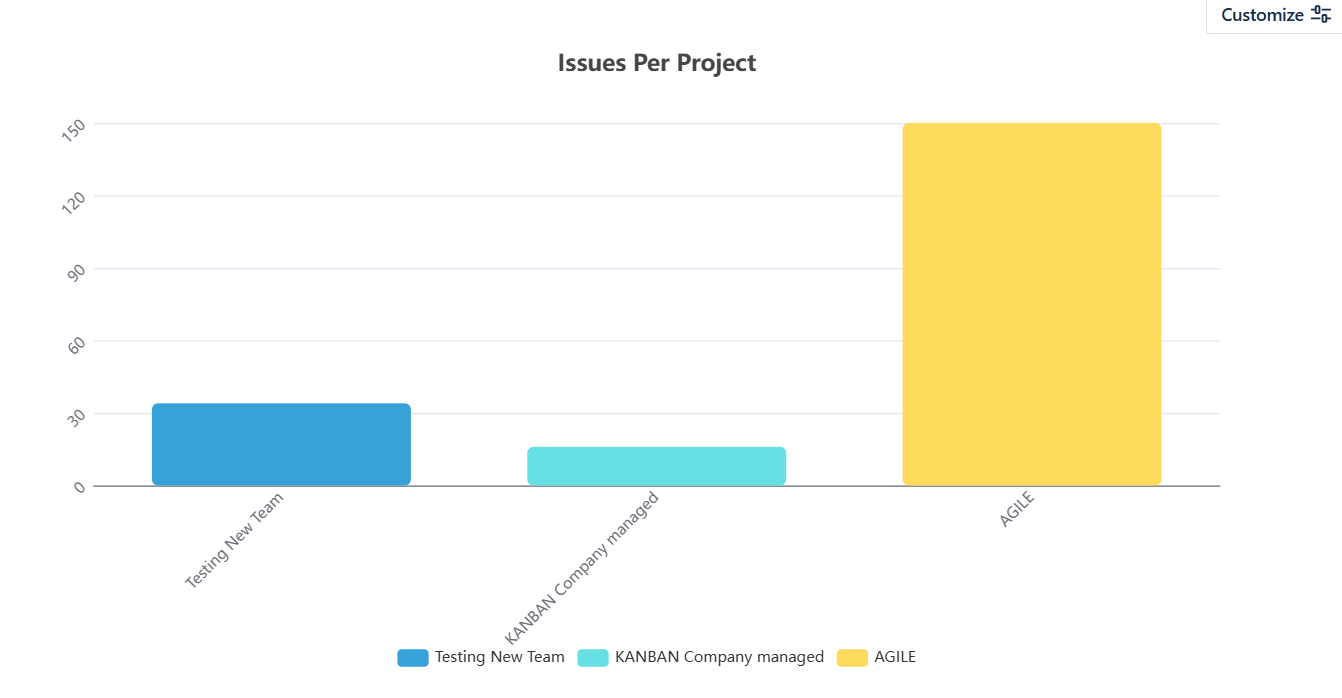
Bar Charts: Great for comparing data across categories (e.g., issues by priority).
Pie Charts: Useful for showing proportions, such as the distribution of tasks across assignees.
Line Charts: Perfect for tracking trends over time, such as sprint progress or issue resolution time.
Funnel Charts: Effective for visualizing the flow of issues through different workflow stages.
By customizing your charts, you can drill down into Jira’s data, making it easier to understand and use. But before we dive into how to create custom charts in Jira, let’s explore the benefits of customizing your Jira reports.
Why You Should Create Custom Charts in Jira
There are several compelling reasons why you should create custom charts in Jira, especially if you're managing complex projects or teams. Here are some of the key benefits:
Improved Data Visibility: Custom charts allow you to focus on key metrics like issue resolution time, sprint velocity, or team capacity, making it easier to track and analyze important data.
Tailored Reporting for Stakeholders: Custom charts help you tailor reports to different roles—executives get high-level progress, while project managers can see detailed sprint and issue analysis.
Increased Efficiency in Decision-Making: With real-time, easy-to-understand visualizations, you can make faster, data-driven decisions during retrospectives and stakeholder meetings.
Better Resource Allocation: Visualizing workloads through custom charts helps identify bottlenecks and ensure tasks are properly distributed, keeping the project on track.
Enhanced Jira Project Performance Insights: Custom charts provide deeper insights into project performance, tracking key trends and helping your team identify areas for improvement.
How to Create Custom Charts in Jira
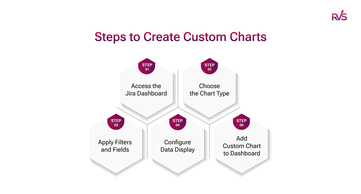
Now that we’ve covered why you should use custom charts, let's walk through how to create custom charts in Jira. Here’s a step-by-step guide to building your own charts and visualizations:
Step 1: Access the Jira Dashboard
To start, navigate to your Jira dashboard. This is the central hub where you can view all your team’s projects and workflows.
If you don’t already have a dashboard set up, you’ll need to create one.
You can do this by selecting Dashboards from the top menu and clicking on Create new dashboard.
Step 2: Choose the Chart Type
Once you’re in your dashboard,
Click on the Add a new gadget button. This will open a selection of gadgets, each offering different types of charts.
Select the Chart Gadget, which is typically used for creating bar charts, pie charts, and other visualizations.
You’ll also find Time Reporting Gadgets and other custom charting tools in this section.
Step 3: Apply Filters and Fields
Now that you’ve selected your chart type, you need to specify which data will be used to generate the chart. You can apply filters to customize the data you want to visualize. For example, you can filter issues by status, assignee, priority, or time frame.
By applying filters, you can narrow down the data to show only what’s relevant for your needs. This step is crucial in ensuring that your chart displays the most meaningful and actionable data.
Step 4: Configure Data Display
Next, you’ll configure how the data will be displayed in your chart. This involves setting parameters such as:
Time Period: Choose whether you want to view data over the last 7 days, 30 days, or a custom date range.
Grouping: Group your data by various attributes like issue type, assignee, or project.
Labels and Legends: Add labels to your chart for clarity and to make it easy to interpret.
Step 5: Add Custom Chart to Dashboard
Once you’ve configured your chart, click Save to add it to your Jira dashboard. You can now access your custom chart directly from the dashboard and make adjustments as needed.
Best Practices for Using Custom Charts in Jira
To get the most out of your custom charts in Jira, it’s essential to follow some best practices. Here are a few tips to ensure your charts are effective and easy to use:
Choose the Right Chart Type for Your Data: Not all chart types are suitable for every kind of data. For example, bar charts are great for comparing categories, while line charts are ideal for tracking trends over time. Choose a chart type that best represents the data you’re visualizing.
Keep It Simple: Don’t overload your charts with too much data. Focus on the most important metrics, and keep your charts clean and easy to read. The goal is to provide clarity, not overwhelm.
Update Your Charts Regularly: Ensure that your charts reflect the most current data by updating them regularly. This will ensure that your insights are always relevant and help your team make real-time decisions.
Create Role-Specific Dashboards: Different team members may need different insights. Customize dashboards for project managers, team leads, and executives to ensure that each person has access to the information that matters most to them.
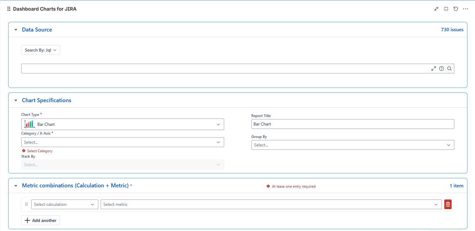
If you want to take your custom chart creation to the next level, Dashboard Charts for Jira by RVS Softek is the tool you need. This powerful Jira add-on simplifies the process of creating custom charts and provides advanced features for more granular data visualization.
Introducing Dashboard Charts for Jira By RVS Softek
Dashboard Charts for Jira is a powerful add-on that enhances Jira’s native reporting capabilities by providing advanced data visualization options. Unlike Jira's default charts, which are limited in their customization and depth, dashboard charts allow you to create fully customizable, interactive visualizations tailored to your project’s unique needs.
With Dashboard Charts, you can easily track critical project metrics, monitor progress in real-time, and get deeper insights into team performance, resource allocation, and issue resolution.
Key Features of RVS’s Dashboard Charts for Jira:
Seamless Integration with Jira: RVS’s Dashboard Charts integrate smoothly with your existing Jira setup, so you don’t need any additional software or complex configurations.
Wide Range of Chart Types: Whether you need bar charts, pie charts, line charts, or funnel charts, RVS has you covered.
Dynamic Filters: Apply custom filters and fields to ensure your charts display the most relevant data.
Interactive Dashboards: Create interactive dashboards that update in real-time, providing ongoing insights into your team’s performance.
In addition to RVS’s Dashboard Charts for Jira, RVS Softek offers other powerful tools like Agile Tools for Jira, Issue Hierarchy, and Capacity Planner, all designed to further enhance your ability to visualize data, track project performance, and optimize your workflow management within Jira.
Integrating custom charts into your Jira project management process is a crucial step for teams looking to gain deeper insights, make informed decisions, and stay ahead of their objectives.
With tools like RVS’s Dashboard Charts for Jira, you can gain real-time visibility, optimize workflows, and ensure your team stays aligned with key project goals. Custom charts don’t just help you visualize data; they empower you to manage projects more effectively, track critical metrics, and make faster, data-driven decisions.
Start using RVS’s Dashboard Charts for Jira today and take the first step toward transforming your project management approach. Visualize, analyze, and enhance your team’s performance like never before.
Ready to elevate your project management? Schedule your RVS demo today!
Frequently asked questions
1. What are custom charts in Jira, and how can they improve project management?
Custom charts in Jira allow you to visualize critical metrics like sprint velocity, issue resolution time, and team workload. These Jira custom charts for issue tracking and progress help improve decision-making and efficiency by presenting real-time, actionable insights.
2. How can Jira custom charts help with tracking sprint velocity?
By creating Jira charts for sprint velocity, you can easily track the speed at which your team completes tasks. This enables better planning, forecasting, and improved sprint performance tracking.
3. What types of charts can I create in Jira for workload management?
Jira allows you to create various custom charts, such as bar charts and pie charts, to visualize team workloads. Jira charts for sprint velocity and workload help distribute tasks evenly and prevent bottlenecks in your project.
4. How do I create custom charts for issue tracking in Jira?
To create custom charts in Jira, you need to choose the right chart type, apply filters for relevant data, and customize the display to track issues like unresolved tickets, priorities, or assignee workloads. This offers a visual representation of your Jira project performance charts.
5. Why should I use custom charts for Jira project performance?
Custom charts for Jira project performance help monitor KPIs and identify performance trends. Whether it’s tracking sprint progress, issue resolution, or team workload, custom charts give you a clearer view of your project’s health.
6. Can Jira custom charts help with tracking team progress across multiple projects?
Yes, Jira custom charts for issue tracking and progress can track team performance across various projects by aggregating data into one visual display. This provides a comprehensive view of task completion rates, velocity, and resource allocation.
7. How do custom Jira charts improve decision-making in sprint planning?
By using Jira charts for sprint velocity, you can measure past sprint performance and predict future outcomes. Custom charts enhance decision-making by providing insights into team capacity and task completion rates, helping optimize sprint planning.
Recent Blogs
July 9, 2026
Best Jira Time Tracking Apps to Boost Team Productivity (2026)