Metrics for Kanban: How Teams Track Multi-Team Workflow Health
Gulshan
June 17, 2026
Table of Contents
TLDR: The 30-Second Takeaway
The Problem: Teams often rely on lead time, cycle time, and throughput alone, but these high-level metrics don't reveal where work is actually getting delayed across multiple Kanban teams.
The Insight: Workflow health becomes visible when you track status-level metrics such as time in status, aging WIP, flow efficiency, SLEs, and handoff delays.
The Fix: With RVS Softek Time in Status Reports, teams can uncover bottlenecks, measure workflow performance across projects, and make data-driven improvements that increase predictability and delivery speed.
A feature that "should have taken a week" took three. Your dev spent two days on it. QA cleared it in half a day. So where did the other 12 days go?
Most enterprise teams can't answer that. They watch burndown charts and velocity graphs while the real delivery data sits buried in Jira's issue history. Native Jira shows aggregate cycle time, one number, end-to-end. It won't tell you how long a ticket sat in "Waiting for Review" versus "In Review," or which status in Team B's workflow is bottlenecking Team A's intake.
At the single-team scale, that blind spot is manageable. Across 5, 10, or 20 Kanban teams feeding shared pipelines, it compounds into a system where nobody can explain why work takes as long as it does.
Status-level data, how long every ticket spends in every workflow status, across teams, projects, and issue types, is what turns metrics for kanban from theoretical benchmarks into operational signals you can act on. Tools like Time in Status Report by RVS Softek surface exactly this from Jira's issue history.
This blog covers:
The seven core metrics for Kanban at scale
What each one reveals is that aggregate cycle time hides
How to track each one at the status level in Jira
How Time in Status Report turns these metrics into operational signals
Why Metrics for Kanban Break Down at the Multi-Team Level
Three problems show up only in multi-team setups:
Handoff blindness: A ticket exits Team A's board in two days, then sits unassigned in Team B's queue for six more. Each board looks healthy; nobody owns the gap. Without status-level timestamps across both workflows, that wait time is invisible.
Metric fragmentation: When engineering measures cycle time in a control chart, product tracks it in a spreadsheet, and QA doesn't track it at all, there's no shared language for portfolio decisions. Averages get compared across incompatible methods, noise, not signal.
Averages hide the picture: A team averaging 5-day cycle times might finish 80% of tickets in 3 days and 20% in 15. That long tail is where commitments break, and averages suppress it. You need percentile distributions, not means.
All three share one root: insufficient status-level data.
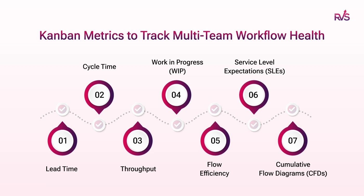
The Metrics for Kanban that actually expose where work stalls
Native Jira gives you the headline numbers. These status-level metrics give you the story behind them, where tickets wait, where handoffs drag, and which stage is quietly eating your delivery time.
Here are the metrics:
1. Lead Time: The Customer's Clock
Lead time is the total elapsed time from when a request is committed to when it's delivered, the metric stakeholders actually experience.
Formula: Lead Time = Resolution Date – Creation Date (or intake date).
Teams go wrong in tracking lead time per team, not per value stream. A feature moving through discovery, engineering, QA, and DevOps has a lead time that's the sum of all transit and queue times, not just one board's share. Break it into stages and you might find "standard features" average 18 days, with 11 days accumulated across three waiting statuses. That's a queue problem, not a speed problem.
set a 90-day range, filter by issue type to segment by class of service, and compare per-status time against the total.
Look for: If any intake/queue status accounts for more than 30% of total lead time, you have a handoff problem, not a delivery problem.
2. Cycle Time: Where Native Reporting Hits Its Limit
Cycle time starts when work begins ("In Progress") and ends at "Done." It measures execution speed, not the customer's wait.
Formula: Cycle Time = Done Date – In Progress Date.
If a ticket bounces in and out of "In Progress", picked up, blocked, picked up again, native control charts typically record the first entry to final done, overstating active cycle time for blocked items. Separating active-work statuses from passive-wait statuses is what makes flow efficiency analysis possible. When a ticket shows a 12-day cycle time but only 2.5 days of active status time, the story isn't "development is slow", it's 9.5 days of wait time you can now see.
How to Track it:
Use the Time in Status report for issues that reached "Done," paired with the Status Count report to flag tickets bounced back between statuses.
Run per project and consolidate to compare teams with one method.
Look for: Any status averaging more than 20% of your cycle time target deserves a retrospective. "Waiting for Review" and "Blocked" are the chronic offenders.
Insight: Learn the key differences between cycle time and lead time, how each impacts delivery performance, and which metric your Jira team should track to improve workflow efficiency.
Throughput counts how many items a team completes per period. Unlike velocity (story-point-based, incomparable across teams), it counts actual completions.
Formula: Throughput = issues moved to "Done" in a given period.
You can't compare velocity across five teams with different estimation practices. You can compare throughput: "Team A averages 22 items per week, Team B 14" is factual. Beyond the average, track a rolling 8-week average, a throughput histogram (narrow = consistent, wide = unreliable promises), and throughput by issue type to catch bugs eating feature capacity.
How to Track it:
Filter the Time in Status report by your "Done" status, set weekly windows, and note the issue count per window to build a rolling trend. Split by issue type to surface unplanned work.
Look for: A throughput drop without a matching WIP drop usually means blocked items, not reduced capacity.
Lead Time vs Cycle Time vs Throughput: Which Metric Should You Track?
All three metrics measure flow efficiency—but they answer different questions. Learn how lead time, cycle time, and throughput work together to reveal bottlenecks, improve predictability, and optimize delivery performance in Jira.
4. Work in Progress (WIP): The Enterprise Leverage Point
Little's Law is ruthless: Cycle Time = WIP ÷ Throughput. Double WIP at constant throughput, and cycle time doubles.
Every team can enforce its own WIP limits and still feed a shared pipeline with runaway aggregate WIP, a silent bottleneck no single board shows. Track WIP per team, WIP at handoff points, and aging WIP (items open longer than your 85th-percentile cycle time). An item in progress for 2× your average without moving is almost certainly blocked. Surfacing these before they blow an SLA beats explaining failures afterward.
How to Track it:
Filter to active statuses only, sort by time in current status descending, and flag anything past your 85th-percentile threshold.
Add it as a dashboard gadget, and filter by handoff statuses for cross-team visibility.
Look for: If more than 15–20% of active WIP is aging past the threshold on a given day, your WIP limits or escalation process has broken down.
5. Flow Efficiency: The Metric That Exposes Hidden Waste
Formula: Flow Efficiency (%) = (Active work time ÷ Total elapsed time) × 100.
Most teams measuring this first find they're at 10–25%. The rest is wait time. At scale it drops further, more handoffs, more wait points, each invisible on any one board. Native Jira can't calculate this because it requires classifying which statuses are active versus waiting, and that's specific to each workflow.
How to Track it:
In the Average Time in Status report, classify each status as Active or Wait, sum each group's average time, then divide the active by the total.
Repeat monthly to see whether process changes improve flow or just shift the wait between stages.
Look for: Below 25% is common and signals that structural wait time, not team speed, is the constraint. A 50% cut in wait time at one bottleneck beats speeding up active work everywhere. Target the highest-wait status first.
6. Service Level Expectations (SLEs): From Gut Feel to Probability
An SLE is an empirical commitment, "85% of standard features delivered within 18 business days", derived from historical lead time distributions, not aspiration.
Build them: Segment issues by class of service, pull 90 days of lead time per class, and calculate the 50th, 85th, and 95th percentiles. Publish those as SLE tiers and review quarterly. Your 85th percentile is what you can commit to confidently for 85% of similar work. Never use averages; skewed distributions make them misleading. "We can deliver this within 14 business days with 85% confidence" is a different conversation than "we'll try for two weeks."
How to Track it:
If your 85th-percentile lead time is more than 3× your median, a few severely blocked items are creating a heavy tail. Investigate those separately rather than letting them inflate routine commitments.
7. Cumulative Flow Diagrams (CFDs): The Multi-Team Health Chart
A CFD plots the count of items in each status over time. At the multi-team level, it's your primary systemic health signal. Watch for widening bands (a bottleneck forming), flat "done" bands (delivery slowing), and steep entry slopes (intake outpacing delivery). Build CFDs that aggregate across teams and map to value stream stages, not individual board columns.
How to Track it:
Use the Average Time in Status report over a rolling 12 weeks across multiple projects; rising averages in a status signal a widening band. Export weekly snapshots into a stacked area chart, watching inter-team boundary statuses first.
Look for: If the average time in any "Ready for X" status rises for two-plus consecutive weeks, a downstream team's intake is falling behind, and it is far cheaper to fix at week two than week eight.
A Review Cadence That Drives Improvement
Cadence
Audience
Metrics to review
Daily standup
Team
Aging WIP, blocked items, WIP violations
Weekly
Team leads
Cycle time trend, throughput, flow efficiency by stage
Bi-weekly
Program / Portfolio
End-to-end lead time, inter-team queue length, SLE performance
Monthly
Leadership
Throughput trend, predictability, cost of delay
Conclusion
Scaling metrics for Kanban requires more than tracking lead time, cycle time, or throughput in isolation. Enterprise teams need visibility into how work moves across teams, workflows, and handoffs.
This is where the Time in Status Report by RVS Softek becomes valuable. By revealing exactly how long issues spend in each workflow status, across projects, teams, and issue types, it helps organizations uncover bottlenecks, improve flow efficiency, monitor SLE performance, and make data-driven process improvements.
When teams can see where work is waiting, they spend less time debating symptoms and more time fixing root causes. The result is better predictability, faster delivery, and healthier workflows at scale.
Frequently asked questions
Why can't I see where my Jira tickets are losing time?
Native Jira reports aggregate cycle time as a single end-to-end number, so it shows that a ticket took three weeks but not that 12 of those days were spent waiting in "Ready for Review." The lost time lives in status-level data, how long each ticket sits in each status, which sits buried in Jira's issue history until you surface it with a tool like Time in Status Report by RVS Softek.
Which metrics for Kanban actually show where work stalls?
The metrics that expose stalls are average time in status (which stage holds tickets longest), time between status transitions (where handoffs lose time), and status duration over time (whether things are improving). Aggregate metrics like velocity and burndown tell you work is slow; these tell you which status is slow and by how much.
How do I find bottlenecks across multiple Kanban teams?
Track time in status across teams, projects, and issue types in one view rather than team by team. This surfaces cross-team bottlenecks native Jira hides, such as a delay in one team's "In Review" status backing up another team's intake. At the single-team scale the blind spot is manageable; across 5 to 20 teams feeding shared pipelines, it's the difference between explaining delivery delays and guessing at them.
What's the difference between a bottleneck inside a status and a handoff delay?
A status bottleneck means tickets are actively stuck in one stage, like a QA queue that's overloaded. A handoff delay is the gap between statuses, the time a ticket waits after leaving one stage before entering the next, such as sitting "Approved" for 11 hours before "In Deployment." The first needs more capacity; the second needs better coordination, and only transition-level data tells them apart.
How do I prove a process change actually improved delivery?
Compare status duration across the periods before and after the change using a per-time-grain report. Instead of "things feel smoother," you get "average time in 'In Review' dropped from 4.2 hours in January to 2.8 in March, and held there." The week-by-week breakdown also shows exactly when the shift happened and whether it reverted.
Why is the 85th percentile better than the median for delivery commitments?
Median cycle time shows what a typical ticket looks like, but you don't get burned by typical tickets; you get burned by the hard ones. The 85th percentile captures that tail-end behavior, which is the number you need when committing to delivery timelines, setting capacity, or explaining variance to leadership.
Can status-level Kanban metrics work for enterprise teams at scale?
Yes, and that's where they matter most. A single team can often eyeball its own bottlenecks, but across 10 or 20 Kanban teams feeding shared pipelines, status-level data is the only way to explain why work takes as long as it does. Tools like Time in Status Report by RVS Softek pull this from Jira's issue history across all teams, projects, and issue types so the whole system is measurable, not just individual boards.
Recent Blogs
June 17, 2026
Metrics for Kanban: How Teams Track Multi-Team Workflow Health


.webp)
.webp)
.webp)
.webp)
.webp)